Wednesday, April 6, 2016

Favorite Logos

Favorite Logo: Sony


I particularly like the font of "SONY." The letters with serifs adds character and professionalism to the company name. The different font for the slogan "make believe" adds a different character, imagination, to the logo. Combined, the logo in general is simple, appealing and memorable.

Other Logos:
A for ARC by Jose
I liked the script "A," it gives the logo in general a nice touch of elegance and grace. The arcs and curves of the A is complex, yet it gives the logo a very stylistic, simple look. Also, the font is the typical font of big companies in the clothing/accessory department (i.e. Michael Kors, Tommy Hilfiger, etc.)

Socialstat by Nick Kumbari
I like how the words "statistic" and "social" (or "society" related) are drawn together into one image that conveys both meanings. For example, the graph line is the "statistic," and on the line are buildings, maybe representing the economy, businesses, etc. The font is really "mechanic" and digital, emphasizing on the idea of "statistics" from a computer.

Trail Crest by Stevan Rodic
This image of a deer is straight forward and simple. The colors aren't very bold, which makes the overall image less overwhelming to the eye. However, the contrast between the grey and the black background makes the logo memorable.

Tulips by Mmrndm
I liked how the tulip is incorporated into the word "tulips," like a picture in replacement with a letter, but at the same time represents the letter. The two different shades in the tulip creates a modern, digital look. The logo in general is simple yet appealing.

3rd Rock by Vova Nurenberg
The bold yet "dull" green really pops from the dark background. The image of the clover makes the logo "pretty." I like how the image itself adds some flowery look to the logo, and the font color isn't too bold (matches with the flower's color).

Tuesday, March 22, 2016

What's Your Stance? Poster

1. Do you believe your stance clear within your poster?
To some extent, my stance is clear. It is clear in the sense that the viewer could understand the main idea behind the poster, that our oceans are very polluted (shown through the fish on the bottom). However, the viewer may not understand the other half of my stance: polluted waters are affecting human health. I used a cutting board and waves to show that we may be consuming fish that contains plastic--not sure if the cutting board makes this clear. 

2. From your initial thumbnail sketches to your hand drawn draft- Do you feel you were successful in re-creating your poster idea digitally? If not, do you like the new visual outcome?
The thumbnails helped me explore multiple ideas and ways that I could organize my poster, which allowed me to rule out the ones that weren't that strong. There were some changes to my poster from the thumbnail, but in general, I was quite successful in executing the project digitally. 

3. What were the changes you made from your first version to the last version of the poster? 
Instead of having garbage spilling from the fish, I had the fish itself be filled with garbage. It seems that if I did not make this change, my stance would not be that strong/clear. I also changed the location of the information. I originally wanted it to be at the bottom of the page, but then moved some of the info. to the middle, where the waves were. This way, the information could be more evenly distributed on the empty space.

4. Looking over your rubric, which category do you think your project is strongest? Which category do you feel the least confident? 
Strongest: Design. I distributed the information based on their importance in making my stance stronger. I put the most important at the top of the waves, so that the viewer could see it right away (after the title), and the least important at the bottom.
Weakest: Concept. My stance is clear in terms of getting the idea across that the oceans are polluted, but maybe not as clear of the danger of pollution to human health. Refer to question #1.

5. What was the most challenging aspect of the project, conceptually?
The most challenging was that I had two 'parts' to my concept, but didn't know how to execute both without neglecting the other. For example, I would have multiple designs, but they all only expressed one part of my stance, the other part was unclear. 

6. What was most challenging about the project, technically?
The most challenging was using the pen tool for text on a path. When I wanted to make adjustments to paths, the anchor tool and convert anchor got was a bit confusing, since they both had similar jobs. I "experimented" a few times making the same path before I understood how to use both effectively.

First Version 

Final 


Tuesday, January 12, 2016

What's Your Stance!

This post is more of a meme, and its message is about racism and international peace regarding race and religion. I strongly agree with this post because throughout society, there is so much hate for a specific race or religion because of false assumptions, or racist stereotypes. I can to some extent understand why someone may be afraid of a Muslim because of fear and sometimes fear can be uncontrollable, especially with the recent terrorist attacks, but even this fear does not give us any right to hate a group of people! It isn't just not right, but inhumane to the extent that when someone hates without knowing a person, then the person hating the other is 'cold-hearted.'

http://www.cartoonaday.com/images/cartoons/2015/07/TRUMP-over-the-edge-cartoon-390x220.jpg
This political cartoon emphasizes that Donald Trump's plan to run the country is ridiculous-- his campaign is mainly run on his ego and wealth. Although he has money, which can sort of benefit the people, his personality is just "over the edge"--the only things that are keeping him 'high' in polls are his brutal, racist comments, and jokes that are highly insulting). My stance: he has no political experience, is rude, and is not suitable to be our President.

Wednesday, December 23, 2015

Spongebob and Totoro GIF

1. Concept: Spongebob jumping on Totoro. Totoro is sleeping, which represents my "chill" side of my personality, Spongebob represents my "hyperness." By making Spongebob jump on Totoro, it gives the idea that I could be both at the same time.
How I came to this idea: I changed my idea to Totoro and wanted to put someone sleeping on Totoro (like in the actual cartoon), but then I realized that it would be too complicated since I didn't have enough pictures. Then I figured that I could add something "funny," so I thought of using Spongebob instead, thus changing my idea once more.
The image of Spongebob further enhances my concept because throughout the GIF, he is always smiling, which represents optimism.

2. How has the animated GIF evolve from its original idea through the use of Photoshop?
When I started out with the thumbnails and post its, I had a really cliche idea of just someone sleeping. I realized that because of this, my GIF would end up really boring--therefore, I decided to think of something more iconic, and incorporated it with another cartoon to make the idea more interesting.

Sunday, November 29, 2015

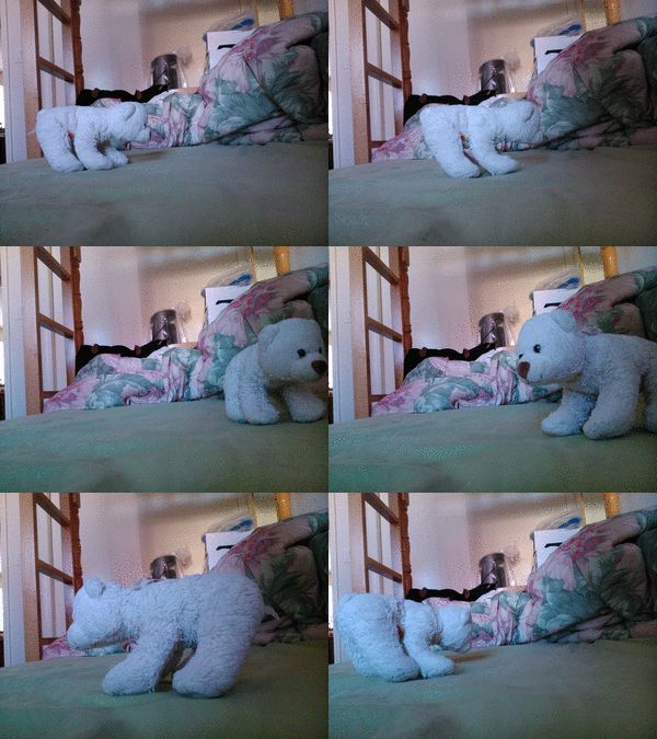
GIF: Poly Bear

 http://i.picasion.com/pic81/8eced3c7a78a08612e4bc232c15fd120.gif

Concept: A polar bear going around in circles.


http://i.picasion.com/pic81/8eced3c7a78a08612e4bc232c15fd120.gif

Monday, November 23, 2015

Portrait Transformation

1. Concept: Tracy is transformed so that her palm is "releasing" a fireball. The image is supposed to be a replica of Peter Petrelli from the T.V. show Heroes. This is to represent our true selves, that there are good qualities but also flaws in each person. The fireball is to represent who we really are- our hearts are "made of fire."
2. Satisfaction: I am satisfied with the glow and the fireball because that's the main subject of my concept-- I worked on this part of the project the most. However, I am not happy with my background. I think that the background was so bright that it took away much of the attention from the fireball. If I had chosen a darker image of a street, maybe a more suburban area, the "plainness" of the background would draw more attention to the fireball.

Original Photographs:


Final

3. Process: When I first started the project, I was hesitant to pick a "busy" background because I thought that if the background was too plain, it would make Tracy look very lonely, so I tried to pick a city street background. The sky was overwhelmingly bright though, so I used a layer mask to darken the entire background. After the layer mask, the image still seemed very bright, thus I was forced to have to paint black over the sky. I lowered the opacity of the brush so that the sky wouldn't actually be "black." For the glow of the fireball, I used yellow, orange, and red paint. Again, I lowered the opacity so that the paint won't be so strong. I also smudged the colors lightly so that they could blend in with the background but still stand out.